Central Tendency
- Mean
- Median
- Mode
Range:
- Max
- Min
- Quantiles
- Outlier
Dispersion
- Variance
- Standard Deviation
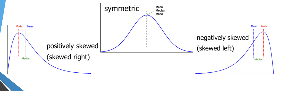
Skew
Mean
Population Mean - Sample Mean - Weighted Mean - Trimmed Mean - mean after removing outliers
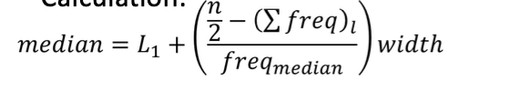
Median
Suitable for skewed data
Expensive to compute for large dataset, solution = approximate for grouped data
Mode
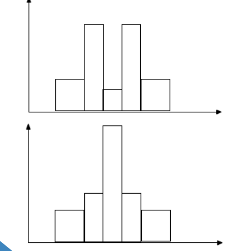
Most occurring value in dataset Unimodal - moderately skewed data: Under Normal Distribution :
Multi Modal
Bimodal
Two Peaks Result of combining 2 different processes, eg. body mass of males and females
Trimodal
Dispersion
Variance ( | s )
Population: Sample: s
Once rearranged: Incremental and efficient computation of variance:
Note:
Rearranging the formula to enables you to add datapoints incrementally
- This allows for incremental and efficient computation of variance, as the sum of squares (Σx_i^2) can be updated with each new data point.
![INFO] Note This video explains why we divide by in sample populations
Graphical Displays
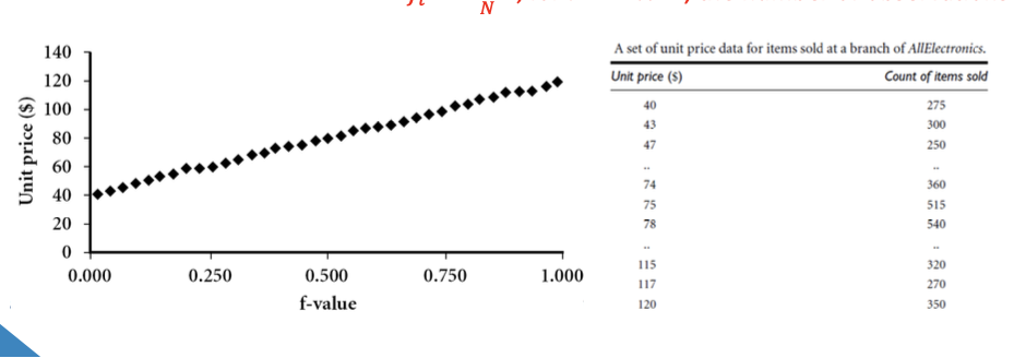
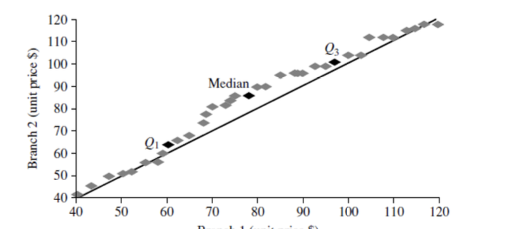
Boxplot - 5 number summary (min, , median, , max) Histogram - x-axis are values, y-axis represent frequencies Quantile plot - each value is paired with indicating that approximately 100 of data are Quantile-quantile plot: graphs quantiles of univariant distribution against quantiles of another Scatter Plot: pair of values plotted as points on a plane
Boxplot
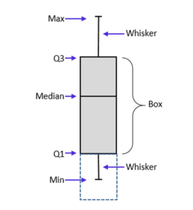 = 25th percentile
= 75th percentile
= 25th percentile
= 75th percentile
IQR
Outlier - usually, a value higher/lower than IQR
Bar Chart
Plots categorical quantitative data
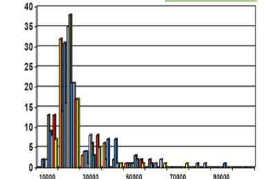
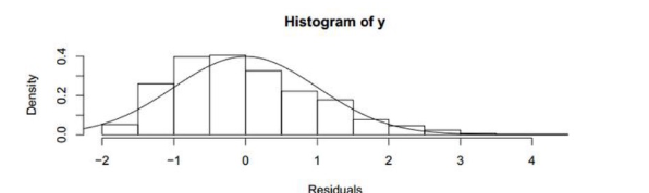
Histogram
Shows distributions of variables represented by area
Plot binned quantitative data
Quantile Plot
Plots quantile information for all data
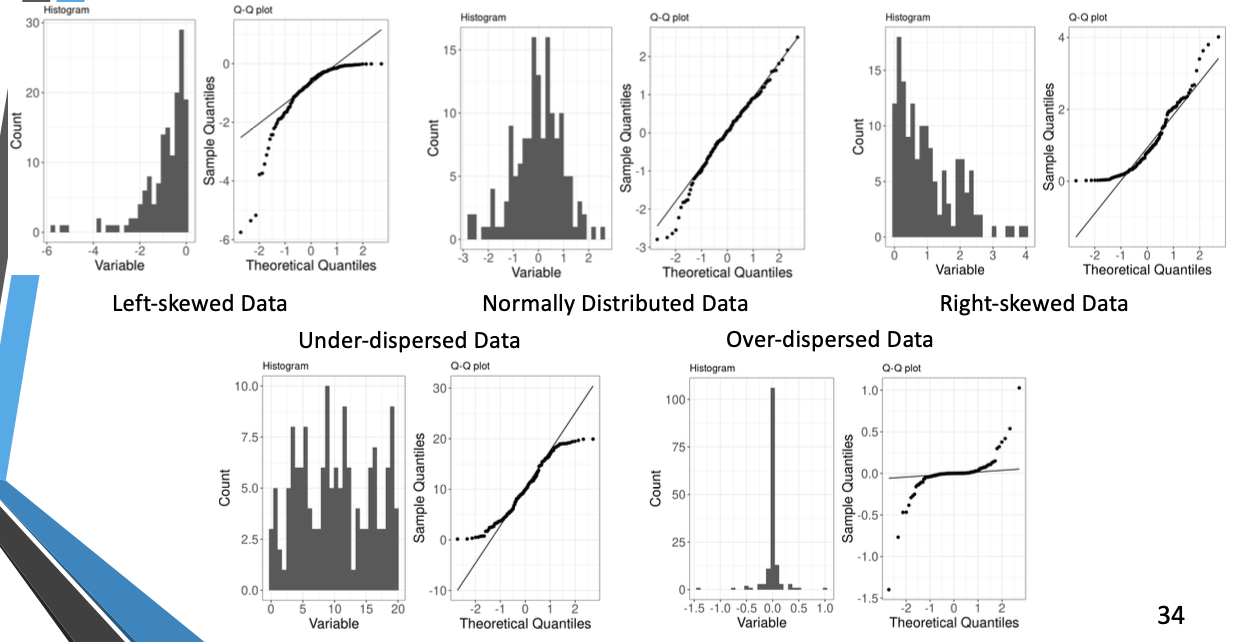
Quantile-quantile plot
Graphs quantiles of one univariate distribution against the corresponding quantiles of another
If the data distribution is close to normal, the plotted points will lie close to a sloped straight line
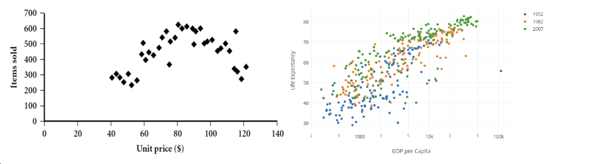
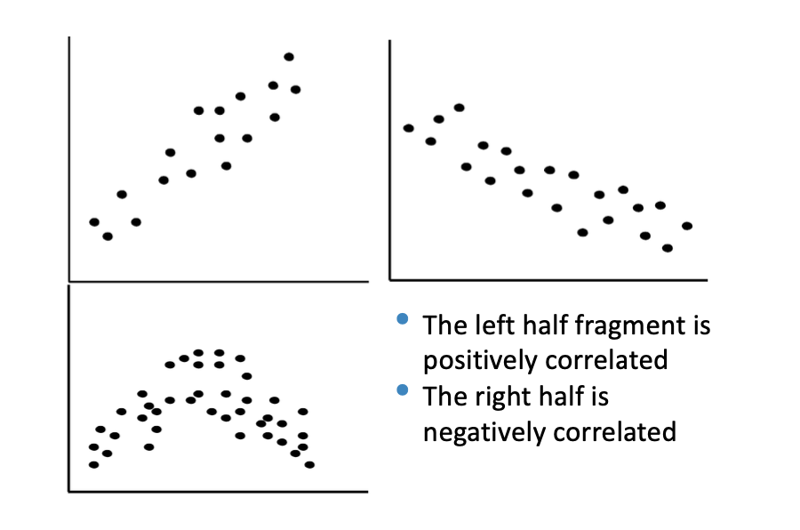
Scatter Plot